Costs
Part of How to read an annual trend report in about twenty minutes
Reading annual trend reports statistics without fooling yourself
Annual trend reports statistics 2027 and six questions that qualify a figure: where the arithmetic goes wrong, and how to read the chart, not the number.
A single figure lifted from an annual report will outlive the report, the method, and usually the company that published it. It gets pasted into a deck, quoted in a post, cited by someone who cites the post, and three years later it is common knowledge with no traceable origin.
The only defense is a habit: refuse to repeat a number you cannot describe. This page sets out what describing it means, and the criteria a figure has to meet before it is worth carrying.
What to take away
- Every number has a denominator, and the denominator carries most of the meaning. A growth figure without a base is not information.
- A margin of error covers random sampling error and nothing else. It says nothing about a leading question or a skewed panel.
- Reports exist to be cited, so the promoted figure is selected for being quotable, not for being reliable.
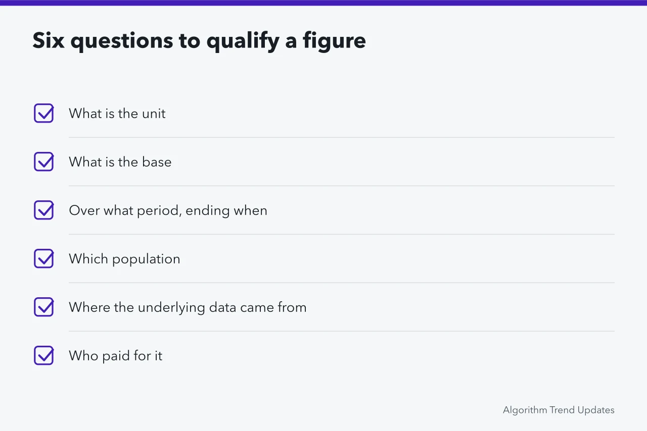
Six questions that qualify a figure
- What is the unit. People, accounts, sessions, posts, events and dollars are not interchangeable, and reports slide between them within a paragraph.
- What is the base. Growth of a large share and growth from almost nothing look identical as percentages and mean completely different things.
- Over what period, ending when. A figure ending at a peak is a different claim from the same figure ending three months later.
- Which population. Not the number of respondents. Who they were and how they were reached.
- Where the underlying data came from. Observed behavior, administrative records, or people describing themselves.
- Who paid for it, and what result would have been inconvenient.
The last question is not cynicism. Commissioned research is often careful, and funding is often disclosed.
But a report from a company selling what it finds growing has a predictable direction of error. Predicting that direction is what reading critically means. The risks of relying on published figures show what that direction looks like once a number circulates.
Where the arithmetic goes wrong
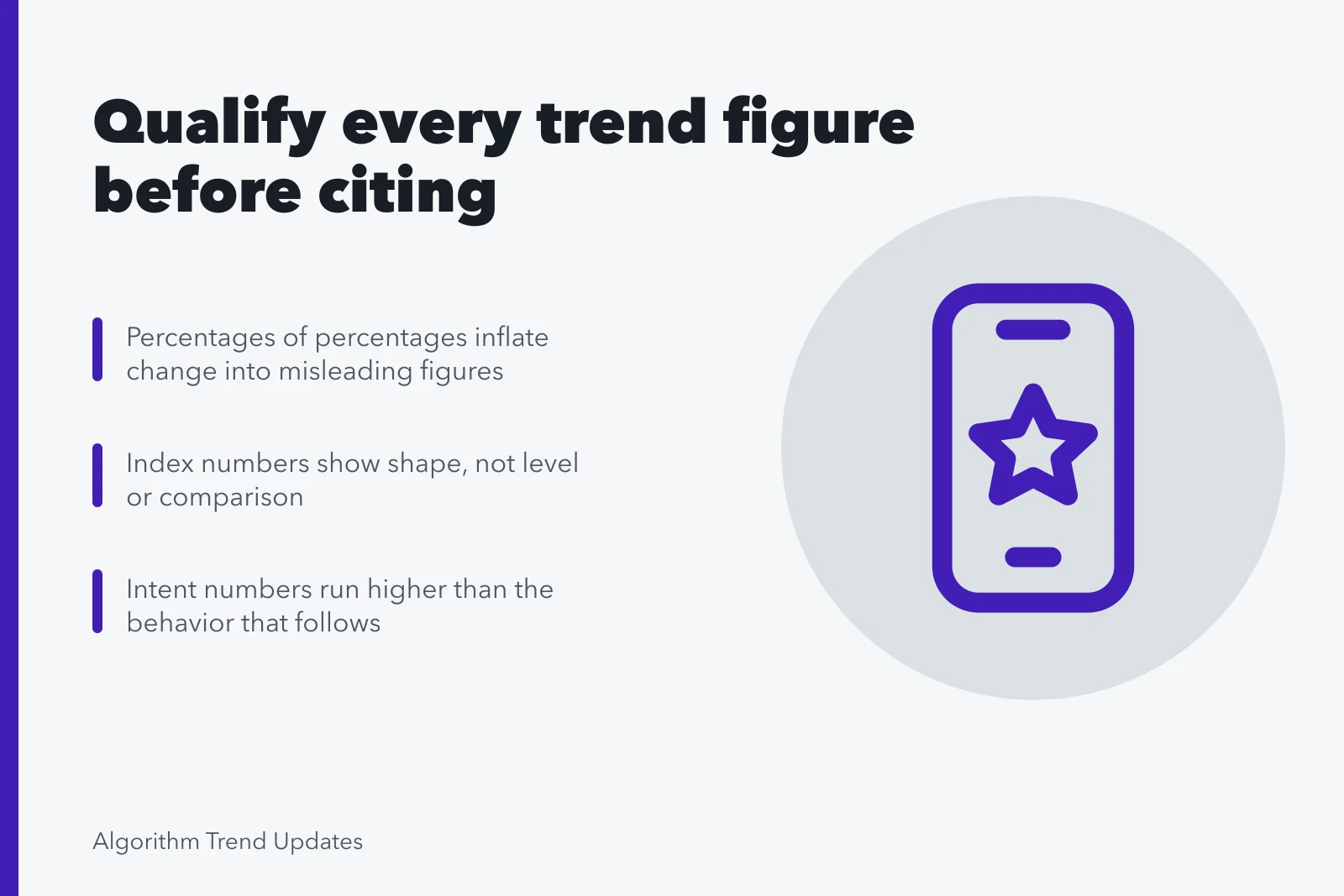
Percentages of percentages produce the most common error in this field. A share moving from one level to another has changed by a number of percentage points, and expressing that as a percentage change gives a much larger, technically true, thoroughly misleading figure. Both appear in reports, sometimes in the same table.
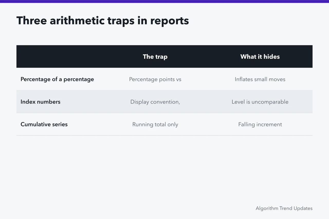
Index numbers are the second. Setting a series to one hundred at some reference point is a display convention, not a measurement. Two indexed series on one chart cannot be compared in level at all, only in shape, and a series indexed to its own peak is guaranteed to show a decline afterwards regardless of what happened.
Cumulative series are the third. A running total can only rise, so a chart of cumulative anything always slopes up and always looks like growth. The interesting quantity is the increment, and it is often falling while the cumulative line climbs.
Self-reported numbers measure what people say
Survey figures about behavior are recollections, and recollections about frequency are unreliable in known directions.
Intent figures are worse: asking if someone plans to act next year measures how the plan sounds aloud. So intent numbers run consistently higher than the behavior that follows. Whether a figure came from watching people or asking them is the first thing the comparison of how trend tools are built settles.
This is not an argument against surveys. It is an argument for reading the questionnaire. Question order, the available options, and whether a neutral response was offered all move the result more than most people expect, and none of that is captured by the reported precision.
A margin of error describes how much a figure would bounce around if you drew another random sample from the same frame. It does not describe a badly worded question, a frame that missed a group, or people answering to look reasonable. Those errors are usually larger and are never in the footnote.
Criteria for using a figure
| The figure | Usable for | Not usable for |
|---|---|---|
| Observed behavior on a known platform, absolute counts | Describing that platform | The wider market |
| Observed behavior, indexed | Shape and timing | Level, or comparison to another index |
| Probability-sampled survey with published questions | A population estimate within the stated error | Anything about behavior it did not ask about |
| Opt-in panel survey | Relative movement within that panel over time | A population estimate |
| A vendor's own customer data | The vendor's customers | Anyone who is not a customer |
| A figure with no method note | Nothing | Nothing |
That last row compresses the whole page. Leaving such a figure in its original document is the discipline the overview of annual trend reports asks for.
It is also the row ignored most often. An unqualified number is easier to use than a qualified one, and the qualifications are what stop it being wrong.
Reading the chart, not just the number
Most misreadings are visual before they are numerical. A truncated y-axis turns a small change into a cliff, while two axes at different scales invent a relationship between unrelated series. Unequal time buckets make a bar chart's widest bucket look largest.
None of these require a lie, and the standard catalog of how a chart can mislead covers cases that appear in reputable reports every year.
The practical habit is to read the axes before the shape, and to reconstruct one number from the chart to see whether it matches the text. Where they disagree, the text is usually right and the chart was made later by someone else.
What to record when you decide to keep a figure is covered in the guide to working through a report.
Common questions
A report gives a huge growth figure with no base. Can I use it with a caveat?
No. The caveat does not survive the first time someone quotes you, and you cannot warn a reader about a number whose meaning you do not know yourself.
Is a small sample always a problem?
Not always. A small probability sample from a well-defined frame can support a decent estimate with an honest error range. A large opt-in sample from an unknown frame usually cannot, at any size.
What if the only figure available is a weak one?
Say what it is, say what it cannot support, and use it as an order of magnitude rather than a fact. That is a legitimate use, and it is different from repeating it as a finding.
How do I check whether a widely quoted figure is real?
Follow the citation chain to the original document. A surprising share of well-known figures terminate at a press release, a slide with no source, or a paper that says something narrower. The same tracing habit applies to the seasonal figures collected in the statistics on calendar-driven activity.