Rules
Part of How to read an annual trend report in about twenty minutes
Annual trend reports examples for people who want the details for 2027
Annual trend reports examples for 2027, what each one measures, which charts carry real signal, and the traps that make a headline number look bigger than it is.
What to take away
Annual trend reports examples for 2027 share one trait: a stated method. Every trending list measures a rate of change against a baseline.
It is a derivative, not a level. That fact explains why the top item can be tiny in absolute terms, why the largest topics are often absent, and why conclusions drawn from these lists collapse under one query.
- A trend score is a rate of change, so a stable giant never appears and a near-zero term can top the list.
- Ask which baseline a report uses before you quote its number. Absolute change, ratio to a rolling baseline, standardized score, share of total and forecast residual answer five different questions.
- A sawtooth that repeats every year is the calendar, not growth. Check the same weeks in earlier years before you call anything a trend.
- A peak is followed by a decline you did not cause. Regression toward the mean guarantees it.
- The 2027 reports worth reading name their method, their sample and their window. If a report names none of the three, treat the ranking as decoration.
The 2027 reports worth your time
These are the annual trend reports publishers and marketers actually cite for planning. Each entry says what it is, who it suits, and how it is priced.
- Pew Research Center, Social Media Use reports. Survey-based, published on a rolling schedule rather than once a year. The methodology includes the full questionnaire and sample size. Best for citing platform adoption among US adults with a number you can defend. Free.
- Reuters Institute Digital News Report. Annual, June, based on surveys across roughly forty markets. It is the standard reference for how people find news and how much they trust it. Best for news publishers and anyone selling to them. Free.
- Ofcom Online Nation. Annual, UK, with platform-by-platform reach and time-spent figures drawn from industry data plus survey work. Best for UK-facing planning and for comparing markets. Free.
- We Are Social and Meltwater Digital reports. Annual, January, aggregating platform user figures and ad reach by country. Best for sizing an audience before a campaign. Free, with registration.
- GWI flagship trend reports. Annual and quarterly, built on a large ongoing survey panel with consistent question wording across years. Best for audience segmentation and for spotting a step change rather than a spike. Free summary, paid for the full dataset.
- Edison Research Infinite Dial. Annual, US, on audio, podcast and social habits, with a long consistent series. Best for audio and podcast planning. Free.
- Nielsen Total Audience Report. Periodic, US, on cross-platform viewing and streaming share. Best for video and connected-TV planning. Free summary.
- Sprout Social and Hootsuite annual social media reports. Annual, vendor-published, heavy on platform feature changes and benchmark engagement rates. Useful for feature timelines, but read the benchmarks as vendor data with a commercial interest. Free, with registration.
- Kantar Media Reactions. Annual ranking of platform ad environments by consumer sentiment. Free summary.
- IAB annual internet ad revenue reports. US ad spend totals that most other forecasts are built on. Published with the underlying figures. Free.
The pattern across all of them: the ones worth citing publish their sample, their window and their question wording. The ones that publish a single headline index and no method generate the misreadings below.
What the score is made of
Different tools build the score differently, and the choice decides what surfaces.
- Absolute change favors items that were already large. A small percentage of a big number is still big.
- Ratio to a rolling baseline favors items that were near zero. Anything divided by almost nothing is enormous, which is why obscure terms dominate some lists.
- A standardized score against a recent window is sensitive to window length. The same series looks dramatic on seven days and unremarkable on ninety.
- Share of total moves when anything else moves, so an item can rise on this measure while its own volume falls.
- A residual against a forecast is the most honest of the family and the hardest to explain, because it depends on a model you cannot see.
None of these is wrong. They answer different questions, and a list is only interpretable once you know which one it answers. Asking what a published number actually measures is the habit that runs through the whole overview of annual trend reports.
Four shapes and what they usually mean
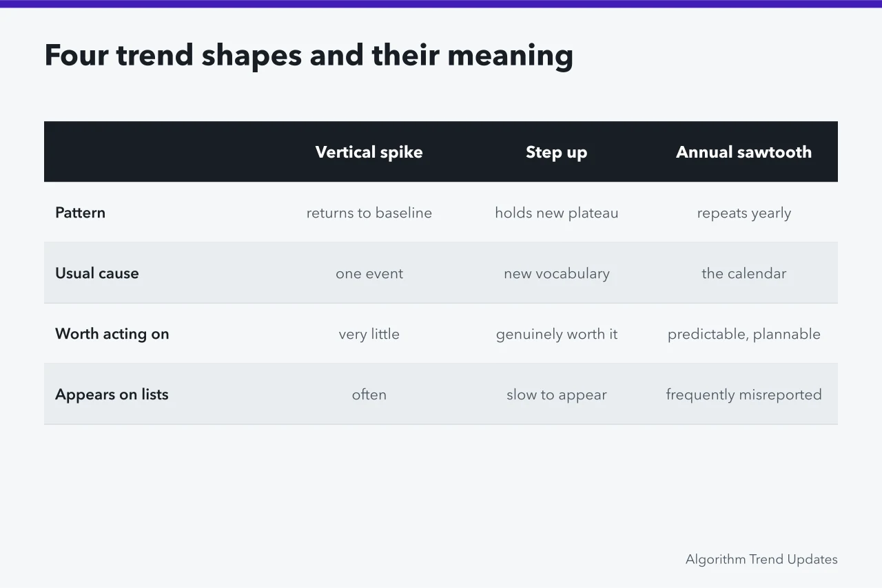
| Shape | Usual explanation | What it is worth |
|---|---|---|
| A vertical spike that returns to baseline within days | One event, one story, one moment of attention | Very little to build on, unless you were already there |
| A step up to a new plateau that holds | New vocabulary entering use, often a renaming | Genuinely worth acting on, and slow to appear on trend lists |
| A repeating annual sawtooth | The calendar | Predictable, plannable, and frequently misreported as growth |
| A slow rise over years with no visible edge | Real adoption | The most valuable and the least likely to appear, because the derivative is small |
The sawtooth produces the most confident wrong conclusions. A term that rises every year in the same weeks is showing you seasonality, and reporting that rise as a trend is reporting that autumn follows summer.
The check costs one query: look at the same weeks in earlier years.
The vertical spike is the second biggest trap, for a different reason. Extreme values are extreme partly because of unusual conditions, so the next reading is almost always closer to ordinary. That is regression toward the mean, and it guarantees anything you build in response to a peak will be measured against a decline you did not cause.
What a spike does not tell you
It does not tell you how many people. A ratio against a small baseline can be driven by a handful of events, and most tools will not show you the underlying counts.
It does not tell you the sentiment or the intent. Attention to a term rises when something goes wrong with it just as reliably as when something goes right, and a purchase-shaped word can spike because of a scandal.
It does not tell you the term meant the same thing throughout. Ambiguous words absorb unrelated events, and a spike in a two-word phrase is often a spike in something that shares those words.
It does not tell you anything about people outside the sample. Every one of these tools observes a population it can reach, and the shape of that population is a design choice made by somebody with commercial interests. The comparison of how different trend tools are built covers how much that choice moves the numbers.
Working through one properly
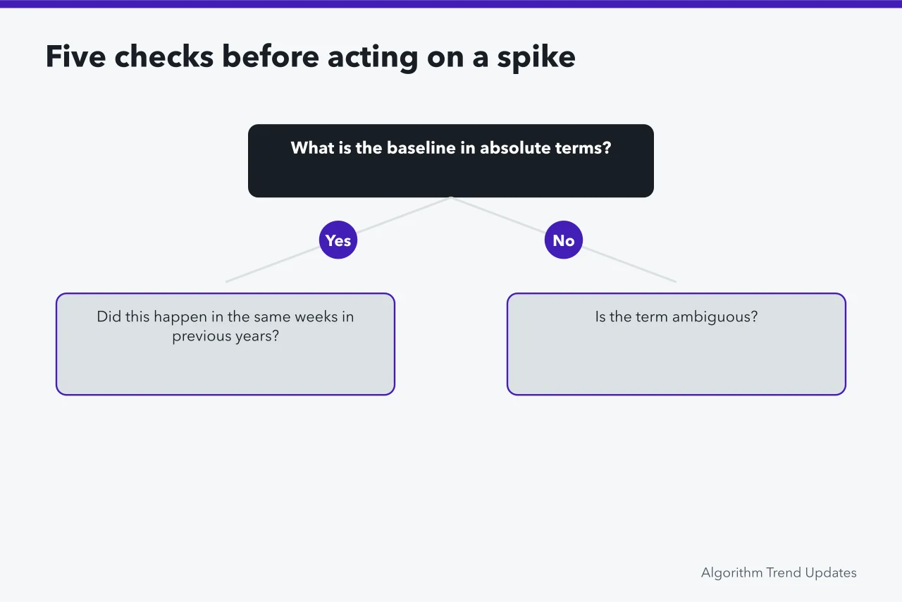
Take any spike you care about and answer five questions in order. What is the baseline in absolute terms, if the tool will show it?
Did this happen in the same weeks in previous years? Is the term ambiguous?
Did the tool change its method or coverage in the period? Is the spike present in a second, independently built source?
If the answers are tiny baseline, yes it is annual, yes the term is ambiguous, and no second source shows it, you have found a measurement artifact and the correct action is none. That outcome is common, it is unexciting, and recognizing it is most of the value of doing this at all.
Common questions
Why is a term I know is huge missing from the trending list?
Because it is stable. A large, steady topic has a small derivative, and derivative is what these lists measure. Absence from a trending list says nothing about size.
Two tools show the same spike on different days. Which is right?
Possibly both. Different windows, time zones and update schedules shift the apparent date by a day or more. Treat the disagreement as a reason to check the window definitions rather than to pick a winner.
Is there any spike worth acting on immediately?
Rarely, and only when you were already positioned for it and the cost of acting is near zero. Building something new in response to a spike usually means arriving after it has passed.
How far back should I look before calling something a trend?
At least two full cycles of whatever periodicity the topic has, which for most consumer subjects means two years. Anything shorter cannot distinguish a trend from a season, and that distinction is the one that matters most.